Designer discusses new logo for 2020 Tokyo Olympics
 0 Comment(s)
 Print
Print E-mail CNTV, April 26, 2016


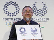
Organizers for the 2020 Olympics unveiled their new logo for the Games. The old emblem needed to be scrapped after plagiarism accusations arose, claiming it was borrowed from a Belgian playhouse. The final design was picked from four candidates that were pared down from the original 14,599 entries. The designer Asao Tokolo was seeking a "bold expression" for his design, using only a simple chequered blue and white pattern.
The winning logo is entitled Harmonized Chequered Emblem. It features three varieties of indigo blue rectangular shapes to represent different countries, cultures and ways of thinking. The designer envisions colour to be added to the design over time leading up to the Games, taking advantage of digital signage and screens, but discussed why he originally chose to make it monochrome.


